As Facebook’s time hop feature informs me; It’s Student election season, so for a trip down memory lane I thought is preserve my ill-fated campaign material on this design blog.
As well as the digital artwork students were allowed to print various leaflets to hand out on campus. I did 4 variants based on different aspects of my manifesto:
Leaflet #1
Leaflet #2
Leaflet #3
Leaflet #4
And like all loosers of a sabbatical election, I went for
Re using the same/similar designs I ran for the Marketing Officer of NaSTA (National Student Television Association)
Profile Photo
Cover Photo
This election I won against a formidably ginger opponent from Nottingham and I went on to become the longest serving exec member in NaSTA History*. A full breakdown of the artwork I did while serving as the Marketing Officer can be found under:‘NaSTA: Designs and Campaigns’
*Longest serving in a single position for 2 and 1/3 terms.
I was the Marketing Coordinator for the Union of Kingston Students for just over a year. The organisation had under gone a massive restructure and a re-brand meaning it was essentially a blank slate. Now I’m fully aware that the Job description implied the role had a hint of design, what they didn’t actually list under the job description was the necessity to be magic and stop time. Due to the re-brand, no existing banners, artwork, even web pages could be reused due to the name change, as such everything was from scratch.
Acting as Marketer, Graphic Designer, Photographer, Videographer, Website developer and IT manager I developed a fairly big back catalogue of design work so I’ll narrow it down to some of my favourites and big pieces I did.
Union Design work and Social Media
For the Union I did practically every bit of design, from website banners, Facebook group cover photos, twitter profile pictures, everything. I’m not going to display everything, but above I’ve put the Union guide (Click the icon to view), two quick public services posters which give you the gist of most poster, the updated brand guidelines (Click to view) I wrote later into the year and the societies guide (Click to view).
Freshers’ is the biggest week of the year for any Student Union. For Kingston it is the main time they sell the majority of the Sports and Societies memberships, recruit the bulk of their volunteers and sell most of their other merchandise.
The Freshers guides, posters and social media posts had to be designed and scheduled. The freshers design developed from a circus themed art board, modern club posters, and designs I liked. The triangle motif developed from my liking of the Klingande, and two triangle sets were developed. Thick triangles with paint splatter, in blue for the Fayre (day time) and more elaborate purple gradient triangles for the night events.
For the Fayre a lot of branded design work was needed; Freshers’ media pack, general signage, A1 posters with directions on them, sail flag banners (which I unfortunately cant find a photo of) and large vynl banners for Freshers fayre and the Hoodie/societies sales stalls in the atrium;
The Freshers’ Ball is the biggest night out of Freshers Week. It’s the only one the Union organises everything about. After the abysmal performance of the previous years ball, Jenny wilson, the events coordinator, blew the 2016 one out of the park. The event was a sell out and was well received by the students. Design wise the ball had several needs, all the social media for it and the physical posters printed in a range of A0 to A4 had to be organised weeks in advance. Not all the stuff I did survives but here’s a small selection.
Clara Amfo Social Media Image
Leathal Bizzle Social Media Image
Clara Amfo Poster
Joint Clara Amfo/Leathal Bizzle Poster
Leathal Bizzle Poster
Final Wristband Poster
The actual bulk of design work, digital and printed that had to be done in the six weeks of getting all the copy, approving the design and printing it, can be seen below, minus all large items such as sail flags, banners and varied t-shirt printing;
Elections are a key part of the Student Union calendar. It’s the only thing a Union really needs to do to in order to secure its funding, as such these are a big deal. For the elections I designed the printed and digital artwork;
There were 2 variants of the banner, which can be seen in one of the photos above, a two decided leaflet, badges, several social media images and 6 variants on A0 posters some of which can be seen on the photos above, which I borrowed from Instagram.
Other than the design work I had to organise the Elections on the NUS cloud system, which I still maintain is the least user-friendly website management tool in the world. Lastly I also filmed and edited the election manifesto videos. I’m aware they’re not perfect, but 34 videos in 2 days a well as all the other tasks isn’t bad considering it was just me;
Officers
Student Officers are essentially the face of the Student Union as such they do need a certain amount of promotional material in order to get their name and face out there.
I still have Nightmares
This started with a photo shoot. Half a day of individual and group shots resulted in the base for every piece of material produced for them through the year.
Business cards were printed, with a brief of they all wanted all their contacts on one side, and then just their own on the other, ignored the stupidity of that and did a business card with their group photo on the back. That way the students could see who the officer (or in the case of needing a referral, the relevant officer is) and their own personal contact details on the reverse. They also got hoodies, T-shirts, polos and a bag but I don’t have photos of any of the shirts I designed at the time.
It meant a student could contact them, and due to the secondary remits (stupid system) the relevant officer could always reply without it bouncing through referrals.
It stops the fractioning of the audience, due to them having remits and a campus, while not all students would care about the campus specific information but all should know about the Education, Welfare, Activities and Union affairs aspects of their jobs.
It was easier to hand over and encourage the officers who were afraid of social media, to embrace social media.
Officer Business Card 2016
Officer Banners 2016
Officer Welcome Banner
Wall Mock Ups
One major project was a giant purple wall with nothing on it. With no real brief apart from “Officer photos” and general promotion of the Union, I mocked up three walls, using photoshop to create realistic interpretations of the wall.
Wall 1 – Frames
Wall 2 – Chalk Boards
Wall 3 – Vectors
Wall 4 – Frames and Vectors
The fourth wall, was an amalgamation of the first and third. Having costed it up, ordered the frames and the canvas pictures of the officers, I left before it could be finalised, but if anyone has a picture of the final product, I would be interested in seeing it.
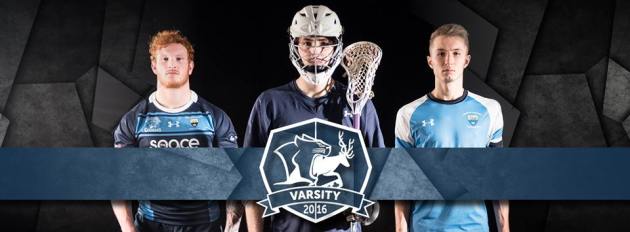
Sports
Varsity is big part of any student calendar, Kingston’s at the time was against Surrey. Taking place in March, I found out early on the Activities Manager was an idiot and saved no hi-res photos after paying photographers for two years. Predicting the impeding list of banners and promotional material to design, I commissioned the University Photographer for a photo-shoot. The boxing arena was transformed with black fabric and all of his equipment into a make-shift studio, where 14 teams were photographed in their Kingston kits. The photos were taken in October, with an editing deadline in December; I only received them in late February which caused a problem with my design schedule for obvious reasons. As such there wasn’t time for me to clean up the photos as much as i would have liked. The fabric can usually be seen in the back of the design work, however I still think the design work, with the black and blue slate stone motif looks amazing.
One of my campaign ideas for selling tickets was the photos used with the varsity logo* and text arranged similar to the Union logo. I thought Inspirational song lyrics would make the campaign fun and give it a fresh feeling, with genres ranging from ACDC to ABBA that would still encompass the competitive spirit, even if you didn’t know they were song lyrics. The Activities Manager vetoed this because it wasn’t his idea. Instead all were “Rather be a Cougar.” Above I’ve restored my original idea, which if you’re reading, would have been awesome.
*I will say at this point I did not design the ‘cougar eating the stag’ logo, I do think its half arsed, but I had to use it due to being an established sub-brand.
For good measure, here are more sporting and varsity designs including both side of the varsity lanyard:
Volunteering, SOCIETIES and other stuff…
Outside of the sporting world I designed a fair few society posters, none of which save due to the numbers, and the odd volunteering posters, but what I did do and remembered to save is here;
Student Media didn’t exist in the Kingston Student Union. As Student media was kind of my wheel house I campaigned to get it started, writing up proposals and drumming up student interest with surveys. Having acquired one amazing student to help get the content the project gathered momentum quickly. The plan was to design one and then have the student base take over after it had established itself. I was in the process of designing it before I left and If the CEO wasn’t a complete and utter tw not for unforeseen circumstances I believe this magazine would have been a great hit. Here is the finished version which unfortunately never made it to print. I would like to thank all the student who took part and believed in the project, hopefully student media will start at some point in the future.
And that concludes this post. I doubt I will ever go back into higher education again, either to work or to learn, but I had fun, and I’m happy with the quality of design which I produced, even if I was spread so thin you could see through me. A tip for anyone designing for a student audience; make it easy, editable and recognisable, chances are you’ll be reusing it for years.
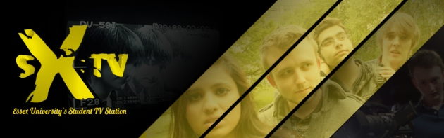
SX:TV was the student television station at Essex University. I was manager of it for about 2 years (2012-2014) and together with my amazing little team and assistant manager, Amiee, we made some odd and wonderful productions, and I will be honest some awful ones too. SX:TV in its time was an award winning station, and while times change I feel that I should showcase some of the designs and some of the amazing videos I helped produce.
While I feature very little in that video, I edited it to give a flavour of what SX:TV was like to be apart of. The Media Centre of Essex University were always a real help so I still owe them for that. I like to think that the work we did with them for the News and Derby day helped contribute to the studios in the new building, but the state of media at Essex right now isn’t the point of this blog.
SX:TV banner
Two of the videos i’m most proud of are the SX:TV summer ball videos. Usually the Union gave us free entry into the summer ball to film, in 2012 for some reason they didn’t. That didn’t stop us. The presenters, camera men, sound operators and editors did these video with no reward.
The shots may not be perfect the lighting may be off, but for a group of self taught volunteers, using cheap equipment and limited resources, it is amazing. That video is everything student TV should be; A fun, budget-less labour of love.
Design wise not much survives. The custom thumbnails on the videos before and during my time as manager are still on the youtube channel, but I imagine the banners, the awards and all the leaflets have been boxed in some dusty room forever. What I do still have is a few social media banners, including the introduction to the new teams for new members;
That being said of course the design work was never the point of SX:TV, it was a TV station not a design studio. The endless hours spent editing for the NaSTA awards, filming of a rubber duck based time travelling thriller and the recruiting of new members every year at freshers’ was what made it fun and worth while. The biggest project ever undertaken was the Derby Day live, which has SX:TV broadcast from 2 different locations live across 8 hours. Within the live studio environment we also had live reporters roaming around collecting footage which was edited on the day and then broadcast live too. It was broadcast online and on a large specially erected screen in the squares. Annoyingly the only hiccup of the day is that it wasn’t recorded, but we’ve still got some photos of the set;
Tom on the Monitor
Tom, Alice and Sam between takes
Alice and Sam, mid conversation
Behind the scenes, in the gallery
Other projects included NaSTA peoples choice awards, Stop motion RED Radio Adverts and even a office like sitcom. I filmed 3 freshers, 2 Summers balls and more Ctrl Alt Del‘s than I can remember but it was all good fun. Possibly my favourite edit was the elections, oddly because of the song. Editing wise it only took an hour or two; trying to match the video qualities was difficult as they were filmed on a mixture of tape and digital cameras but it think it came out great. It brings back a lot of memories so I will let that video play you out:
SX:TV Facebook, @SXTV_online Twitter and of course the SXTVonline Youtube channel still exist if you fancy a bit of nostalgia or just want to check that I’m not making it up, but you might have to track back a few years to find anything by me. Until then I will leave you with an apt quote;
“Student Media is a lot like a man in a tiger suit drinking beer by a lake, just because nobody is going to understand it doesn’t mean you shouldn’t do it” – Daniel E. Wright
If you’ve made it this far into the post, you were probably a member of SX:TV, so I don’t need to tell you how awesome it was. So I’ll end with this logo, and if you won a Nico in the 3rd annual Nico awards, you can download your Nico Award certificate.
This will be shorter than I expected. Despite being a student designer from my 1st year at University, I didn’t save as much artwork as I expected. Over the three years I designed everything from; menus, wall calendars, table toppers, place mats, and even the wallpaper that’s still in the SU bar. The main bulk of it was posters for events, and the relevant social media versions of those posters. Essex Student Union went through a massive re-brand in my final year which I was asked to consult on, but as most of my work was before this I doubt the bulk of it survives in any capacity, but if you have any photos of; SU T-shirts, Level Up menus, event posters, ‘Milk It!’ posters or any pictures of the revamped SU shop taken between Feb 2012-June 2014, probably was me.
Here is the original artwork I’ve kept and a few photos salvaged from my Facebook, but if you have for any reason kept some, or photographed something which I might have designed, please let me know.


")