The annual Alt NaSTA outing this year happens is the far and exotic paradise of Cornwall. As always novelty t-shirts had to be made, this year in black and white as an homage to the Jolly Roger to complement the pirate theme.
“With Shingles” – Aimee’s shirt 2019
“Drunk” – Vieri’s shirt 2019
“The Murphy Motto” – Muphy’s shirt 2019
“Apocachips” – Hollie’s shirt 2019
“The King of Clubs” – Mitchell’s shirt 2019
“Wanted man” – Tom’s shirt 2019
“Snappy Snap” – Capon’s shirt 2019
“You live or you die” – Giedrė’s shirt 2019
“Who the f*ck is” – Arif’s shrt 2019
As always these were printed by the amazing guys at Red Oak Roller so check them out for all of your shirt printing needs.
What happens when you out grow NaSTA awards but love the people you met there? You make your own; This year alumni from different NaSTA affiliated stations held the first Alt-NaSTA hosted in Vilnus, Lithuania. As is traditional, novelty shirts must be made. While these will or should never be printed again, I still love them…
“Nypho’s of the water” – Giedrė’s shirt 2017
“Designly Hallows” – Mitchell’s shirt 2017
“Shit Arif Says” – Arif’s shrt 2017
“Classy” – Hollie’s shirt 2017
“Murphy Brewing Co.” – Muphy’s shirt 2017
“He does it with a smile” – Capon’s shirt 2017
“#TravelsWithTripod” – Tom William’s shirt 2017
“Captain Italia” – Vieri’s shirt 2017
Alt NaSTA logo
The first Alt-NaSTA ended with the first Alt NaSTA awards. Entry’s included “Tits the musical” by Hollie, “Chorus of the drunk pyramid” by Mitchell, “Crossing Swords” by Vieri and “The Italian scream” by Murphy. Congratulations to Giedre on her highly commended with “The Imperial Murph” and to the winner, Tripod with “NaSTA’d.” Until next time…
And yes… These were actually printed.
As always these were printed by the amazing guys at Red Oak Roller so check them out for all of your shirt printing needs.
The NaSTA awards are a massive part of the Student calendar. Starting in 2015 I designed 4 shirts as a surprise the new station managers of SX:TV and the Infamous Dr. Clift. In 2016 it extended to include the NaSTA alumni, affectionately named by our Italian captain as “lads/sluts on tour”. While these will or should never be printed again, I still love them…
The 2015 collection:
“Northern Comfort” – My Shirt 2015 (Not Printed)
“Head Runner” – Tom Phillips’ Shirt 2015
“Call Me Tripod” – Tom William’s Shirt 2015
“Card Tricks” – Mijrin’s Shirt 2015 (Not Printed)
“404” – Louis’ Shirt 2015
The 2016 collection:
“Captain” – Vieri’s Shirt 2016
“Regrets” – Aimee’s Shirt 2016
“Picklebacks” – Tom Phillips’ Shirt 2016
“SX:TV” – My Shirt 2016
“The Godfather” – Capone’s Shirt 2016
“Albert Media” – Tom William’s Shirt 2016
“C.L.I.F.T” – Louis’ Shirt 2016
“Comrade” – Giedrė’s Shirt 2016
All of these were printed by the amazing guys at Red Oak Roller so check them out for all of your shirt printing needs.
NaSTA is something I’ve mentioned in a previous blog. I was the Marketing Officer the National Student Television Association from April 2014 until June 2016; in that time I designed and implemented all marketing material within that period. I thought it was about time I put them all together to maybe help/inspire the design of other Student Media bodies or just for a bit of nostalgia.
To help with recruitment we needed a video. Not being an amazing editor I decided to go to the best one I know. That video above was edited by Giedrė Balsevičiūtė. While I story boarded it, collected the Alumni quotes and helped collect the footage, she did all the editing, colour correction, typographical animation and put up with my demands of minute tweak so all that glory should go to her. it definitely sets the tone for those who don’t know NaSTA.
Affiliation guides
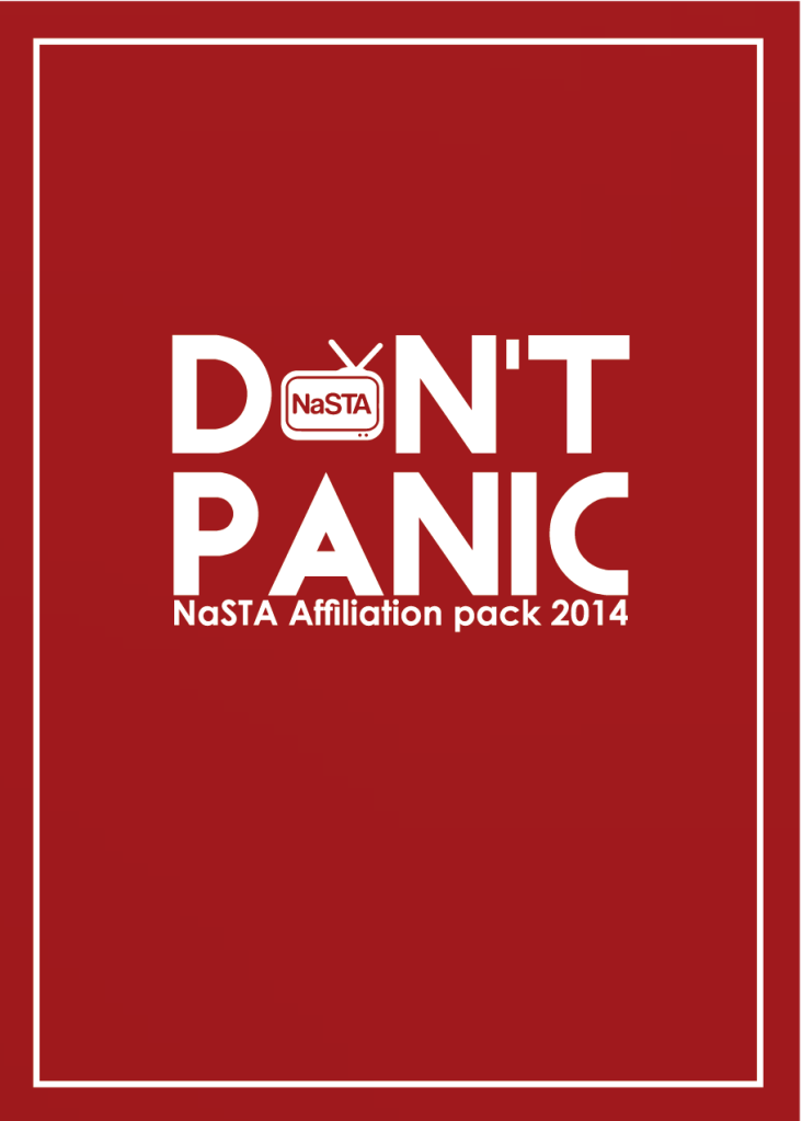
Before I became the marketing officer, affiliation guides were always on the cards but never materialised, both years I decided to make them fun as well as informative. These guides were printed and sent to every affiliated station.
I will apologise now for having to click the images to see them in all their glory. ISSUU and word press aren’t the most compatible of programmes. When I embed them they are too large with no way of editing the dimensions on the page. Click the images for an ISSUU digital copy.
Affiliation guide for the 2014/15 academic year features a nod to a great Douglas Adams’ classic hitchhikers guide to the galaxy on the front page. All NaSTA red, it features the first map documenting all the stations across the country.
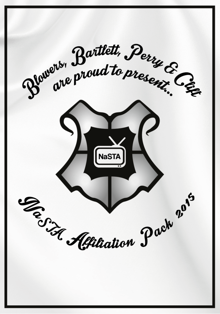
Affiliation guide for the 2015/16 academic year, designed as homage to Harry Potter. The silk pattern was in my mind, a pun on the texture of silk finish paper. This guide also features and info graphic about station’s budgets and facilities conducted by myself during the build up to publication.
I believe this has become a tradition now with the Affiliation pack/guide being sent out after affiliation.
AFFILIATION CAMPAIGN
The quotes from the video formed the affiliation campaign in 2015/6. Alumni quotes from stations up and down the country; from alumni who have advanced into a verity of careers thanks to NaSTA were used in social media and email marketing campaigns. Coupled with images sources from NaSTA’s back catalogue created galley of names and faces for students to relate to while highlight NaSTA’s benefits.
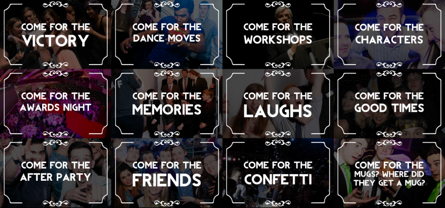
Awards Tickets Campaign
For two years NaSTA had to get people to the awards, selling tickets is big business considering there’s no back up budget and we don’t want an angry SU after us for money we don’t have. So NaSTA needed something to drum up interest. In the last two weeks. The images with accompanying mail chimp e-shots were posted on social media, groups and became a staple of the sales campaign for the awards in 2015 and 2016.
Awards 2015
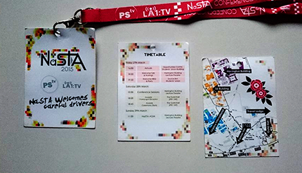
The Awards apart from the official “NaSTA awards 2015” logo which was the best of a horrific bunch of suggestions from one of the hosts stations, I designed most of the work. PSTV the main hosts took the reins very late into the year and as organised as Mr. Murphy was, design wasn’t his priority so I offered my hand.
As well as the Awards programme, lanyards, wristbands, general signage and table plan I also did the award certificates which were presented on the night. In 2016 the team at Leeds did most of the design, but I did do a version of the 2016 award certificate.
SOCIAL MEDIA
The social media channels had existed for ages in NaSTA, with Facebook being the focus, splintering into groups. As well as maintaining the various NaSTA groups, I took the helm of the Facebook, Twitter and Youtube channels for my 2 years in office. Youtube was the most underused form of social media, which for a Student Television based organisation was stupid, so came NaSTA News, short update videos started by me and continued by all members of the Exec. I filled Twitter and Facebook with special designed images to complement the content (which you can see some examples of below) and started the Instagram in my second term. Overall engagement across all three improved during my terms and hopefully they are still be used to their fullest effect.
NaSTA’s social media was always fun to run, and relatively easy with scheduling tools such as Hootsuite and Gramblr. If you want to follow them its /NaSTAuk on Facebook, @NaSTAuk for twitter, @NaSTA_uk for Instagram and NaSTAchannel for Youtube. Hopefully the stuff I did will still be up there and the photos of my face won’t.
REGIONAL CONFERENCE LOGOS
To give each regional conference its own identity and to make it feel more like and event, each conference got its own logo which emulated something about the region in which is was hosted.
Hosted by DUSA TV
Hosted by Kings TV
Hosted by NSTV
Hosted by Guild TV
Hosted by SUSU TV
Hosted by Campus TV
Website
In 2015, me and the then Technical officer, Louis Clift, decided to redesign the NaSTA website. The old wordpress website had become old, poorly maintained and started to break. After it and the wiki became targets for spam bots we decided to scrap it and start again. Louis being a genius, said he’d code a new one, so with me mocking up the layout and him coding we end up with www.nasta.tv as it is today. In case they change it in the future here’s a screenshot of mine and Dr. Clift’s silver-light website;
POST 2016
In the few weeks before the 2016 Awards, I had an idea for a marketing campaign for selling tickets for the awards. “What’s your NaSTA story” would be a collection of stories, from alumni and current NaSTA members, of their best moments at the awards themselves. While I didn’t have enough time to action this, I found a small flip camera and gave it to a man I knew was a prolific snap-chatter. I edited this POV video to start the “Whats Your Story” idea, hoping that the next team would finish that idea, unfortunately I doubt they will now…
That’s all folks…
Well that’s as much as I can remember/ have kept hold of. There’s probably more I designed, but having travelled up and down the country, been to 5 NaSTA award ceremonies, hosted a peoples choice award and did a strange spoof series called Know your NaSTA, I feel that I did alright. NaSTA will continue to grow, it’ll probably stumble a few times but overall it will improve, just glad I did my part. For the last time:
NaSTA is the National Student Television Association, and I was the elected marketing officer from April 2014 – June 2016. When I took over NaSTA was ready for a refresh. The previous two marketing officers had resigned midterm due to other commitments and as such the brand has difficulty establishing itself.
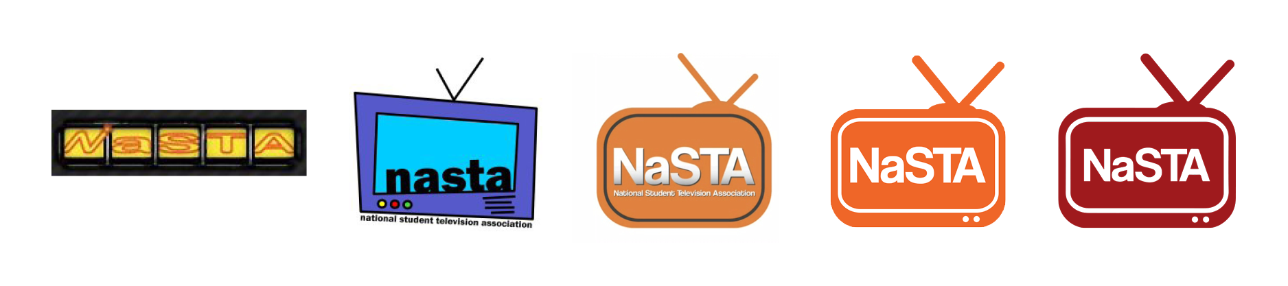
Incomplete history of NaSTA logos
As you can see from the above image, the NaSTA brand has changed a few times over the years, when I took the helm it was the orange rounded TV you can see near the end of that time line. The logo was fine, the simple vector shape and the Coolvetica typeface work well. The colour, the fonts over-usage and tone however were not being well received. Part of the problem was by coincidence, NaSTA’s recent chairs had all beckoned from NUTS (The former brand of Nottingham) and with the awards being held in Nottingham in 2012, there were perceptions that NaSTA was becoming dominated by a particular social circle, and the unintentionally matched orange based colour scheme did nothing to help this.
An amalgamation of the pre2014 brand
The old brand consisted of either a white logo on orange or orange logo on white. One issue was the Coolvetica font was used across the board and gave the association a child-like quality when matched with the nickelodeon-esque colour scheme you can see above. Recurring motifs running across the brand either the radial colour bands used to separate the base colour from photographs and three vectors which were used with a 40% opacity to fill in some white space behind text and cropped photos.
Having taken office it was time to move NaSTA into a brand and style that matched it’s ambitions of being respectable in the eyes of the television industry. The old style was scrapped and as a first action a new colour was chosen. Research showed the most common colour for a station brand was blue, with the SRA using green and the SPA using an odd combo of pink blue and yellow, I decided upon a deep red. It was similar enough to the orange that it wasn’t a complete departure and different enough to set it apart. The particular shade was actually the colour of my old editing suit in Essex and thus the rich NaSTA red was born.
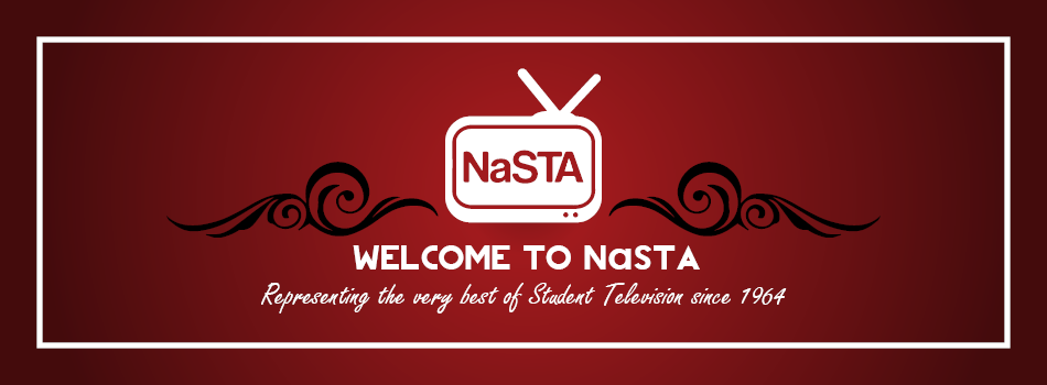
NaSTA brand as of 2014
To complement the red, black and white became a go to secondary pallet. To stop the red looking to flat, and to mix it up certain deigned pieces like social particularly on social media a radial gradient was added. Some white textured backgrounds snuck their way in to the rotation as constant red backdrops made everything look similar so a regular rotation of motifs were employed to kept it fresh.
Here’s some mailchimp e-shot images to show the use of vectors in digital marketing, and the colour scheme in action.
Finally in the refresh came a matter of fonts. Coolvetica had to be scrapped, in my opinion it was too cartoony for usage across the board and on top of that it wasn’t a default font, as such couldn’t be viewed unless the font was installed on your machine without embedding. Century Gothic was chosen as a replacement as it’s a nice, clean, san serif font which was being used on the website (and still is I hope). To match this new professional look, Century Gothic bold was used for headlines, or in design work; Revolution (with Century Gothic bold as the Lower case ‘a’ of NaSTA as it was an uppercase fonts) for emphasis.
NaSTA website 2012
New NaSTA website 2014
NaSTA as a brand will always evolve, the only things that I can guarantee won’t change are the little ‘a’ and a big ‘NSTA’ but consistency makes a brand recognisable by students and professionals alike. While everyone will want to put their own mark on it, I hope what I did across the two years give NaSTA’s brand a good foundation to progress from.
I will post a more in-depth post about the design work I did over the two and a bit years I was NaSTA marketing officer, but for now I will leave you with the basic guidelines I put together which can be found here; NaSTA Brand Guidlines